Notes view layouts in Lattuce — Live, Read, and a sticky outline
Live, Read, and Split note layouts in Lattuce — a sticky outline rail follows your headings, tablet stacked editing, and structure editing stays in Tools.
Lecture notes and chapter drafts rarely stay short. The notes vault at lattuce.app now treats how you view a note and how the layout fits your screen as one system — so you can write, read, and jump between sections without losing context.
Before you start
| You need | Why |
|---|---|
| A Lattuce account at lattuce.app | Notes vault lives in the cloud workspace |
| A note with at least two headings | The sticky outline rail appears only when sections exist |
Open Notes, pick a note with headings, and choose a view mode from the header (or the mobile writing toolbar on tablet and phone). You can also open the Notes demo without an account.
Three view modes
| Mode | Label in the UI | What you see | Best for |
|---|---|---|---|
| Live | Live | Formatted editing (Obsidian-style live preview) with inline formatting | Day-to-day writing, lecture capture, drafting |
| Read | Read | Formatted preview only — no editor chrome | Reviewing, presenting, sharing a read-only link |
| Source + preview | Source + preview (Split on compact chrome) | Raw markdown beside the formatted preview | Tables, paste-heavy edits, checking source syntax |
Your choice is remembered between sessions. On phone layouts the toolbar offers Edit and Read preview; split source + preview appears on wider split-pane workspaces.
Read-first entry: opening a note with ?view=preview lands in Read with a prominent path back to editing — useful when you share a note as reading material, not as a draft.
Layout by screen size
The vault adapts the note column to the device you are on:
| Band | Approx. width | Vault layout | Note column |
|---|---|---|---|
| Phone | ≤767px | Stacked panes (list ↔ note) | One surface at a time — Live or Read |
| Tablet | 768–1023px | Vault, note, and Tools side by side | In Live, editor and read preview stacked so you see formatting while you type |
| Desktop | ≥1024px | Full workspace with resizable Vault and Tools | Live shows the editor; Read shows preview; Split shows source + preview |
On tablet, you still get the mobile writing toolbar — Edit note, insert blocks, links/tools, undo, and Read preview — without hunting through overflow menus.
Beside notes (note2= in the URL) use the same stacked Live + read preview on tablet. Deep links to headings stay on the editing surface so outline clicks and shared URLs land in the right section.
Sticky outline rail
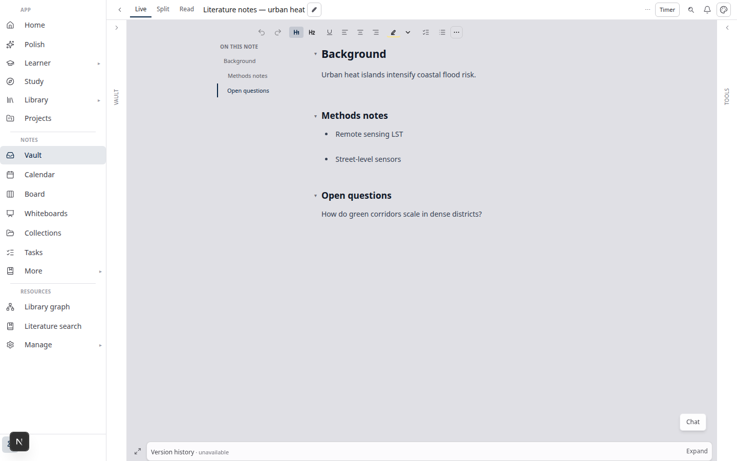
When a note has at least two headings, Live and Read can show a section navigator beside the document:
- Wide layouts — a sticky left rail (“On this note”) with scroll spy: the active section highlights as you scroll.
- Narrow layouts — the same sections appear as horizontal chips above the content.
Click a section to scroll smoothly to that heading and set a #heading-id in the URL — handy for deep links and for picking up where you left off.
In Live, outline clicks stay in Live. The rail does not force a switch to Read just to jump to “Methods” or “Results.”
Navigation vs structure editing
The sticky rail is navigation only. Reorder headings, promote/demote levels, fold sections, and drag-and-drop outline edits remain in Tools → Edit outline.
That split keeps the rail fast and readable while power-user structure work stays in one predictable place — especially on wide layouts where the Tools column is already open.
The rail hides when you already have enough navigation on screen — for example focus-writing mode, a second note open beside the first, or a dedicated outline column in Tools.
Tablet stacked Live + preview
On tablet widths, Live can show the editor and the read preview at once. You edit with live formatting in the top pane and see the fully rendered note below.
When both panes are visible, section links stay tied to the editor so outline clicks and browser hash URLs scroll to the right heading without jumping between panes.
Tips
- Long reading — switch to Read and use the sticky rail instead of scrolling past blocks you already know.
- Raw markdown fixes — use Source + preview on desktop when you need to see pipes and fences beside the rendered output.
- Fold sections in preview — use Tools → Edit outline (label click on headings with body text toggles fold; use the context menu “Scroll to heading” when you want navigation instead).
- Beside notes on tablet — open a second note with
note2=in the URL; the pinned beside pane uses the same stacked live + preview pattern.
Related reading
- Try Lattuce without sign-up — open Notes from the
/tryhub - Notion vs Lattuce — where the notes vault fits in the research stack
- Lattuce vs research apps — comparisons hub (more apps on the calendar)
Bottom line
Live for writing with formatting, Read for clean review, Source + preview when you need the raw file beside the rendered page — and a sticky outline in Live and Read so long notes stay navigable on laptop, tablet, and phone. Structure editing stays in Tools; the rail is for moving through the note, not restructuring it.